BRANDING
Aklat Jeddo
DESIGNED TO PROVOKE NOSTALGIA AND WARMTH BEFORE THE FIRST BITE
★
DESIGNED TO PROVOKE NOSTALGIA AND WARMTH BEFORE THE FIRST BITE ★
Brand Foundation
Aklat Jeddo was built as a visual and emotional extension of home. Rooted in heritage, generosity, and craft, the brand translates the warmth of Levantine home cooking into a cohesive identity system. At its core, the brand exists to preserve memory through design, honoring tradition while presenting it in a contemporary, scalable format. Every visual decision reflects familiarity, comfort, and intentional care.
Visual Identity System
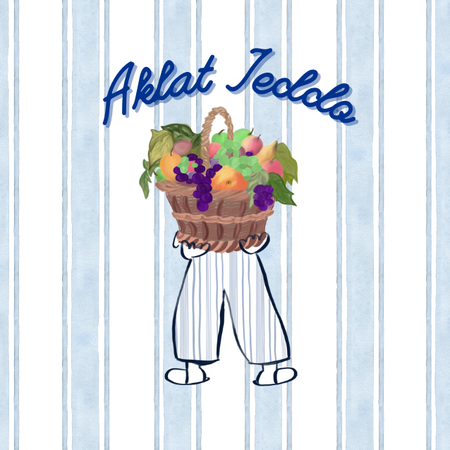
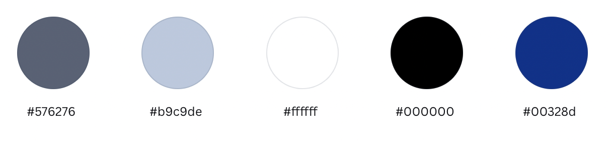
The identity is anchored in a distinctive shade of blue inspired by the light blue striped shorts worn by Serene’s grandfather, a detail pulled directly from lived memory. This blue functions as the brand’s emotional and visual constant, grounding every application across digital and physical touchpoints. Supporting tones are selected to complement food textures while maintaining clarity and consistency. The system balances warmth and simplicity, ensuring the brand remains inviting yet structured.
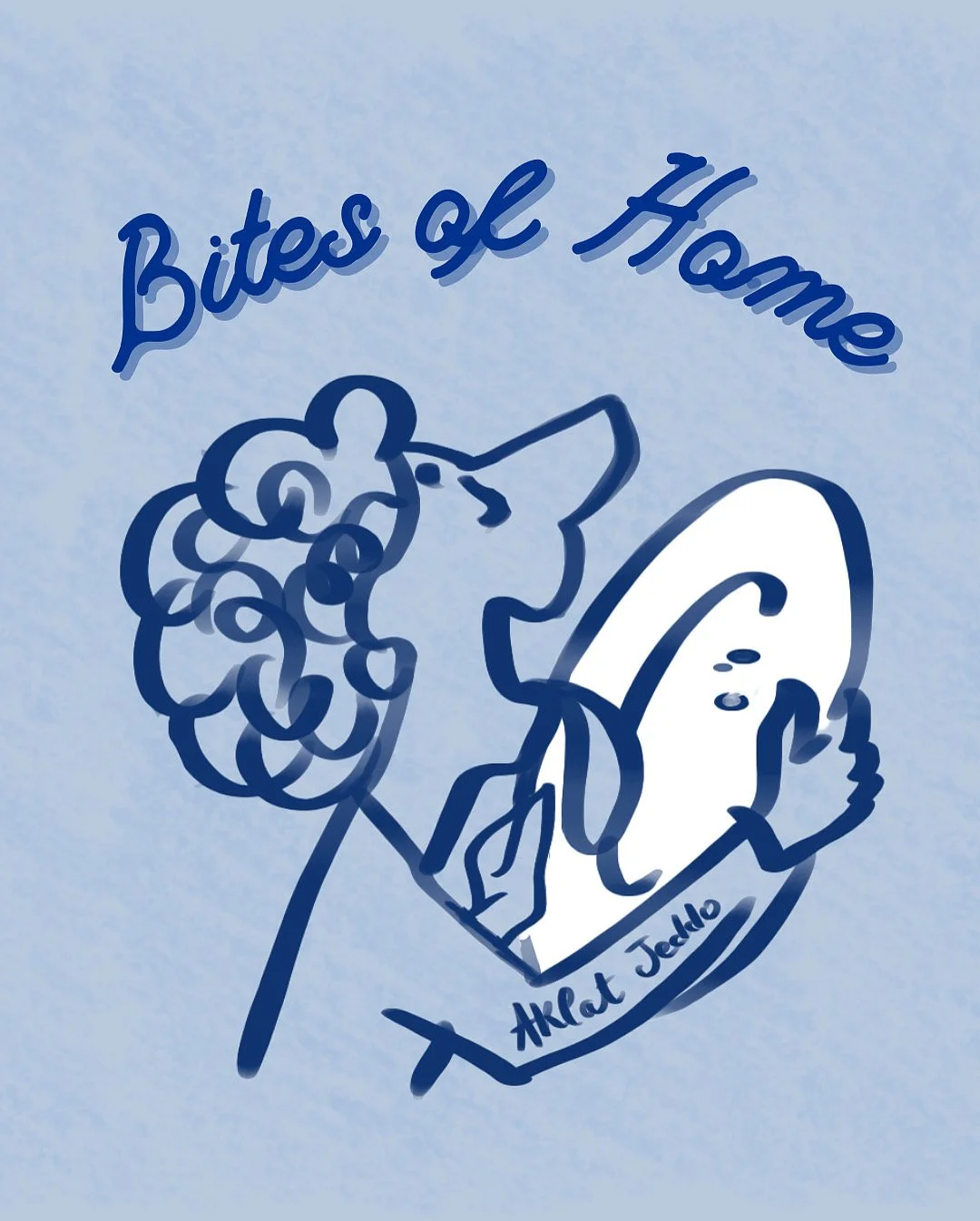
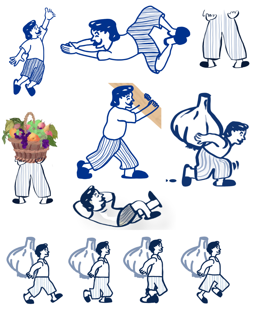
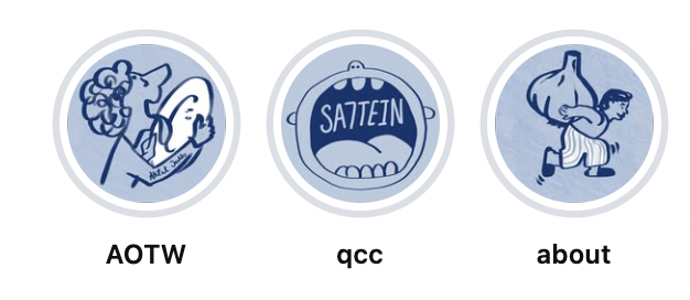
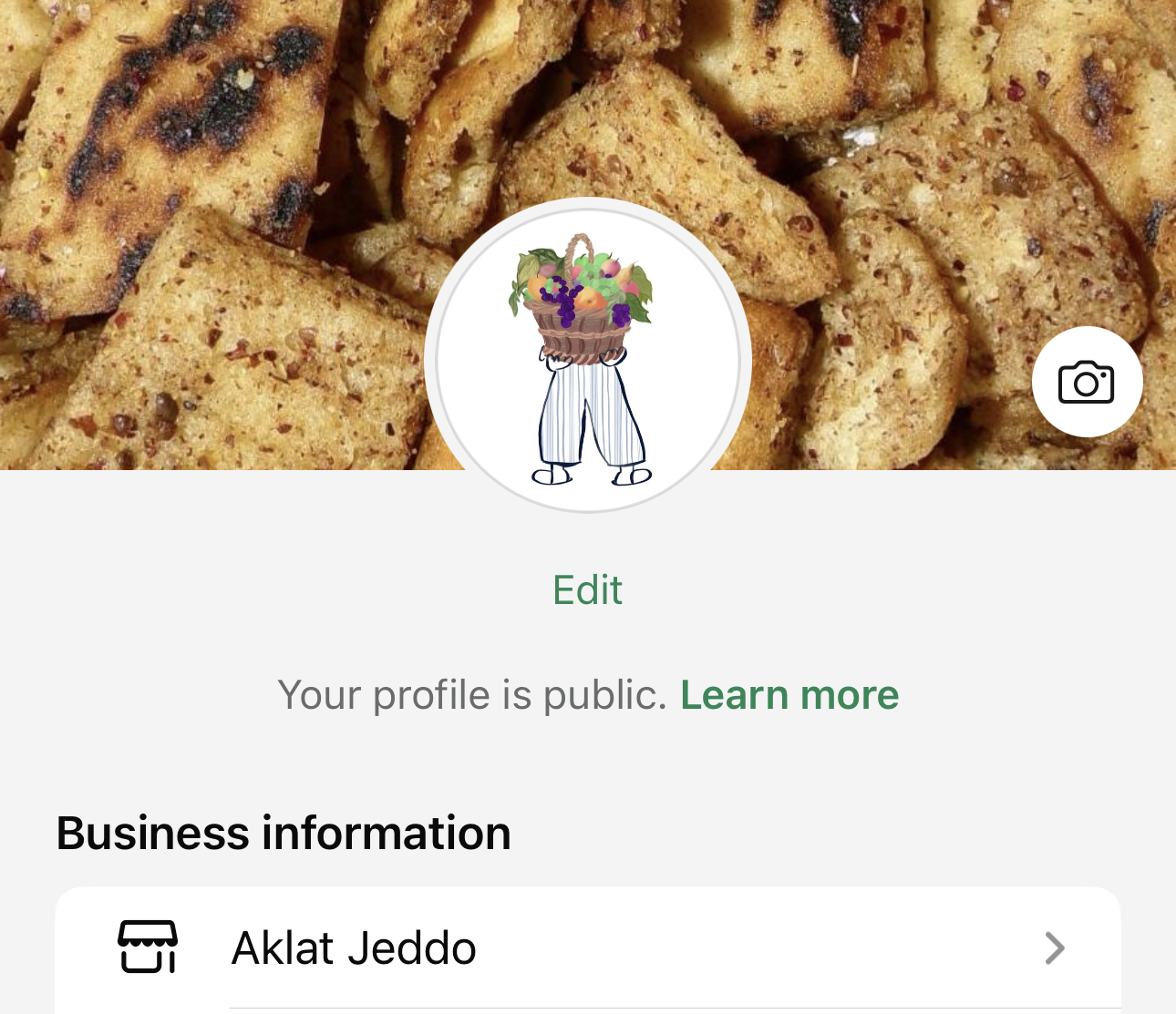
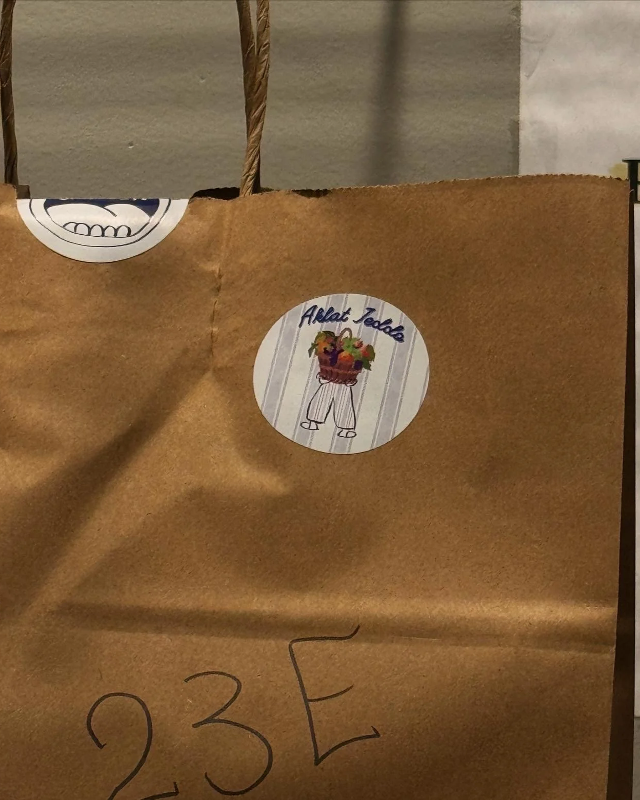
The Mascot: Jeddo
Jeddo is not an abstract character; he is a direct illustration of the founders’ grandfather. His light blue striped shorts, pantoufles, and iconic mustache are carefully replicated from reality, preserving the authenticity of the inspiration. These details transform him from a decorative figure into the emotional anchor of the brand. Jeddo embodies pride in craft, quiet authority, and unconditional hospitality, serving as a storytelling device across packaging, campaigns, and digital media.
Graphic Language
The brand’s graphic language merges hand-drawn illustration with food-forward typography and cultural ornamentation. Food, with the help of AI, is often integrated as lettering, reinforcing appetite and playfulness while maintaining cohesion. Line work remains minimal yet expressive, allowing personality without visual clutter. Seasonal elements, such as Ramadan-inspired details, are integrated thoughtfully to maintain cultural relevance without disrupting brand consistency.
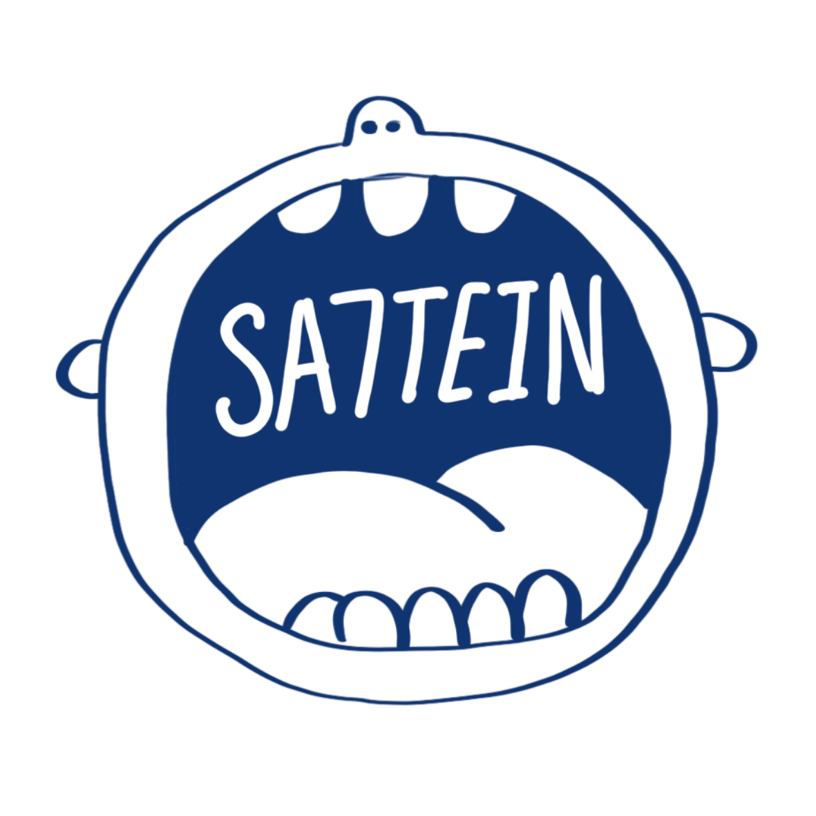
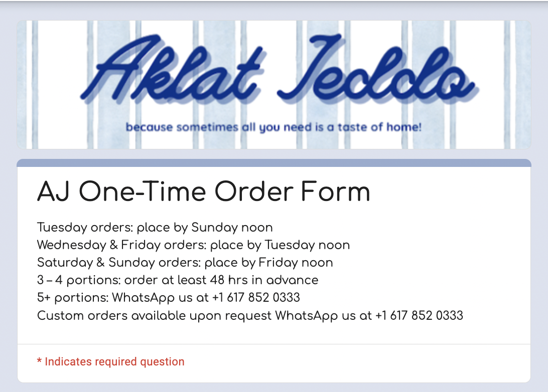
Logo & Typography
The Aklat Jeddo logo system includes a primary mark, adaptable variations, and the “AJ” monogram for scalable use across platforms. Typography balances clarity with personality, clean structures ensure readability, while playful applications appear in headline moments and food-based compositions. This hierarchy allows the brand to scale across digital, packaging, and merchandise applications without losing identity strength.
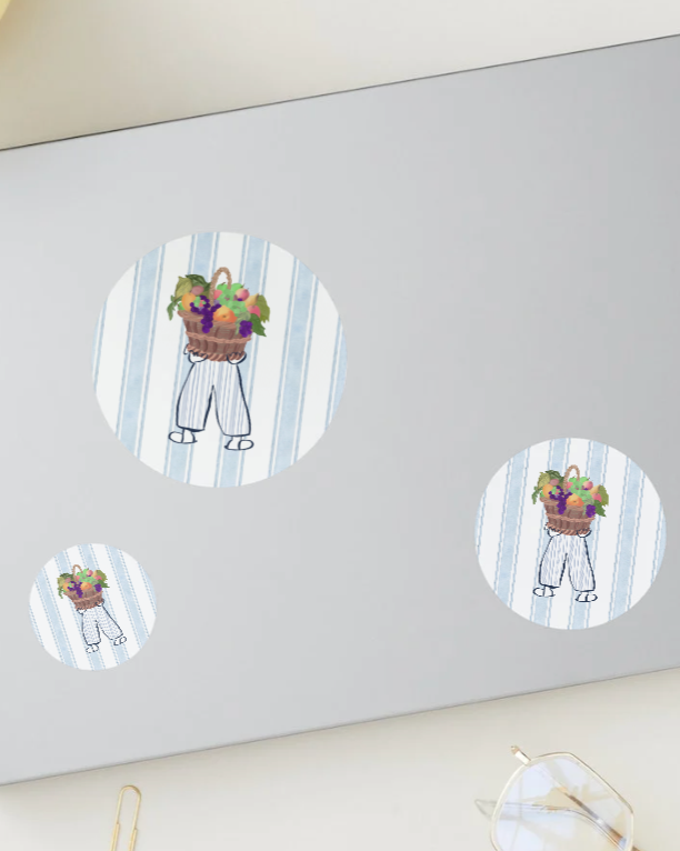
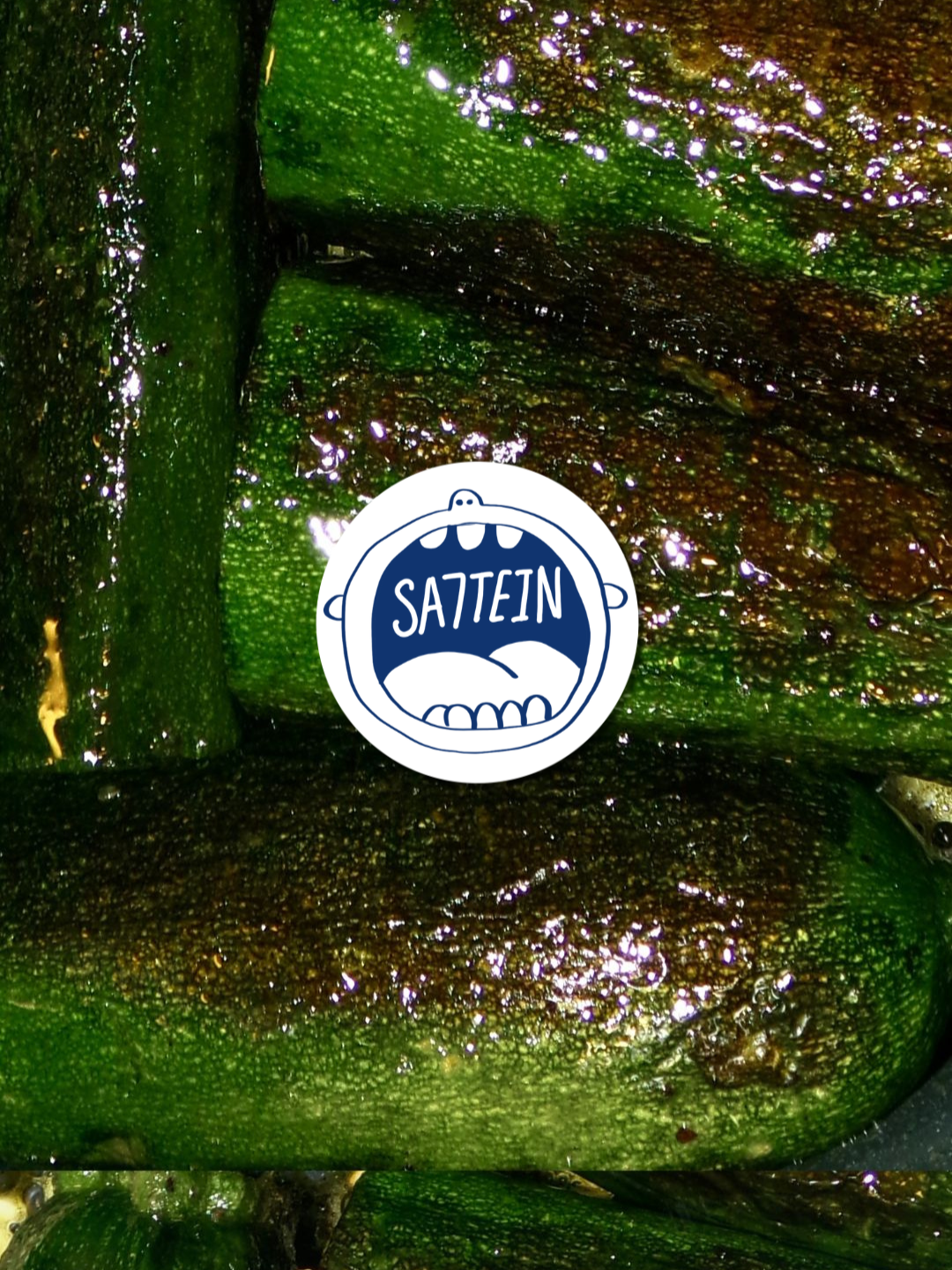
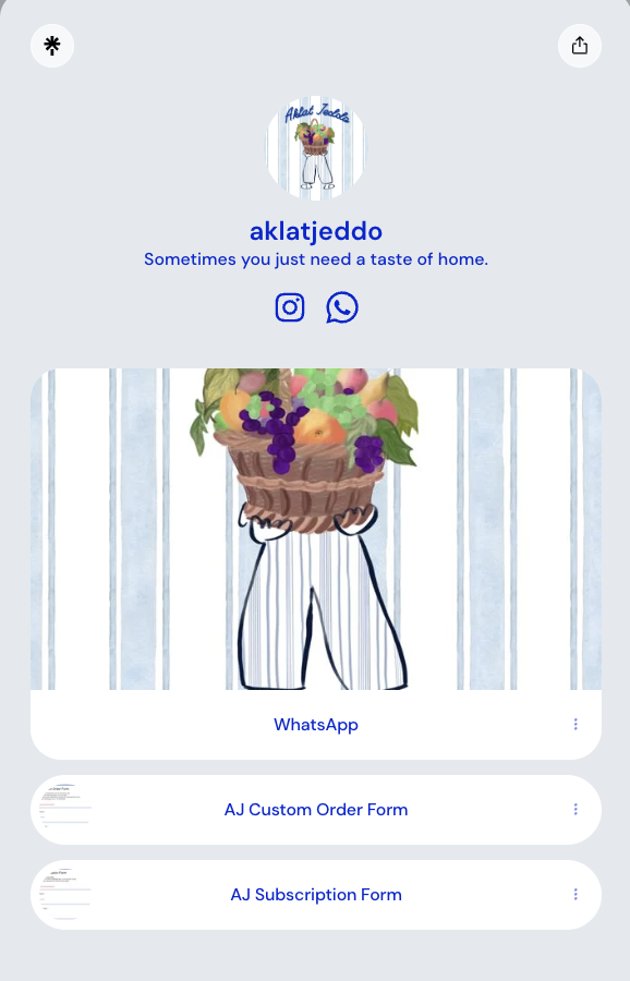
Packaging & Applications
The visual system extends beyond Instagram into physical touchpoints, including labels, stickers, stamps, and promotional materials. Each application reinforces the brand’s emotional tone while maintaining structural consistency. The mascot, blue anchor color, and typographic system adapt fluidly across formats, ensuring cohesion whether viewed on a phone screen or in-hand packaging.
Brand Cohesion
Aklat Jeddo’s identity was designed to function as a unified ecosystem. From social media to packaging to campaign visuals, every element reinforces the same emotional narrative: familiarity, appetite, and home. The consistency across touchpoints strengthens recognition and trust, positioning the brand as both personal and professionally constructed.
EVENT BRANDING
~
EVENT BRANDING ~

Galentine’s Day
The Cherry-Themed Galentine’s Dinner was developed as a fully branded event concept, treating the gathering as a cohesive visual identity rather than a simple dinner. The cherry motif informed the color palette, menu design, table styling, and printed elements, creating intentional consistency across every touchpoint. By aligning décor, typography, and experiential details under one central theme, the event functioned as an immersive brand world: playful, cohesive, and strategically constructed.

Golden Birthday
The Pink and Gold Disco 20th Golden Birthday was conceptualized as a cohesive experiential moment, built around a unified visual and thematic direction. The pink and metallic gold palette guided every design decision, from invitations and décor to lighting, typography, and styling details, ensuring consistency across all touchpoints. By merging disco-inspired nostalgia with a refined color system, the celebration operated as a fully immersive environment, transforming a milestone birthday into a strategically designed brand experience.
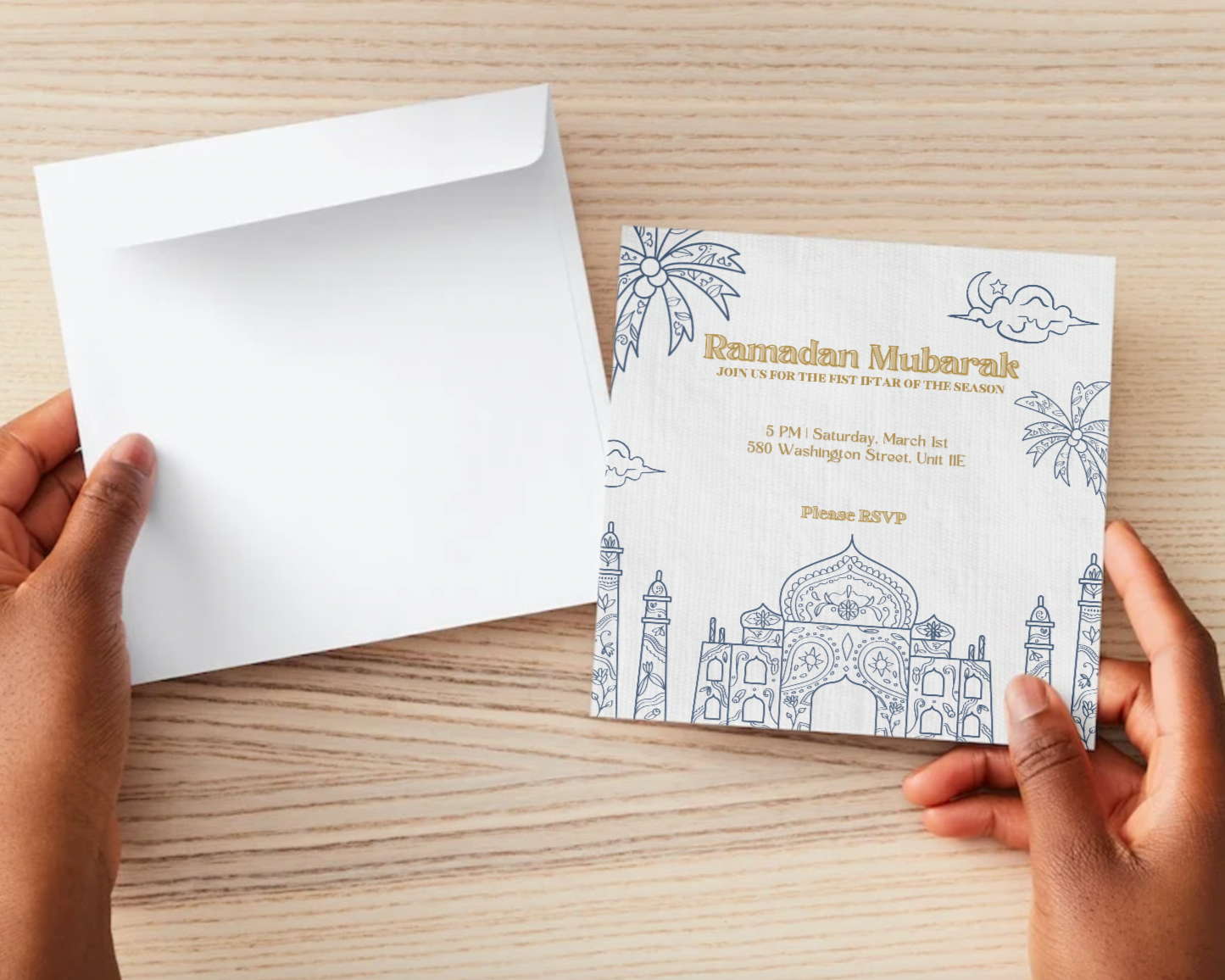
Iftar Ramadan
The Linen and Light Blue Ramadan Iftar was designed as a cohesive event identity centered on softness, restraint, and cultural reverence. A neutral linen base paired with light blue accents established a calm, elevated visual system that guided table styling, printed elements, and spatial composition. By aligning palette, texture, and typography with the spirit of Ramadan, the gathering functioned as an intentional environment, understated, harmonious, and emotionally grounded.
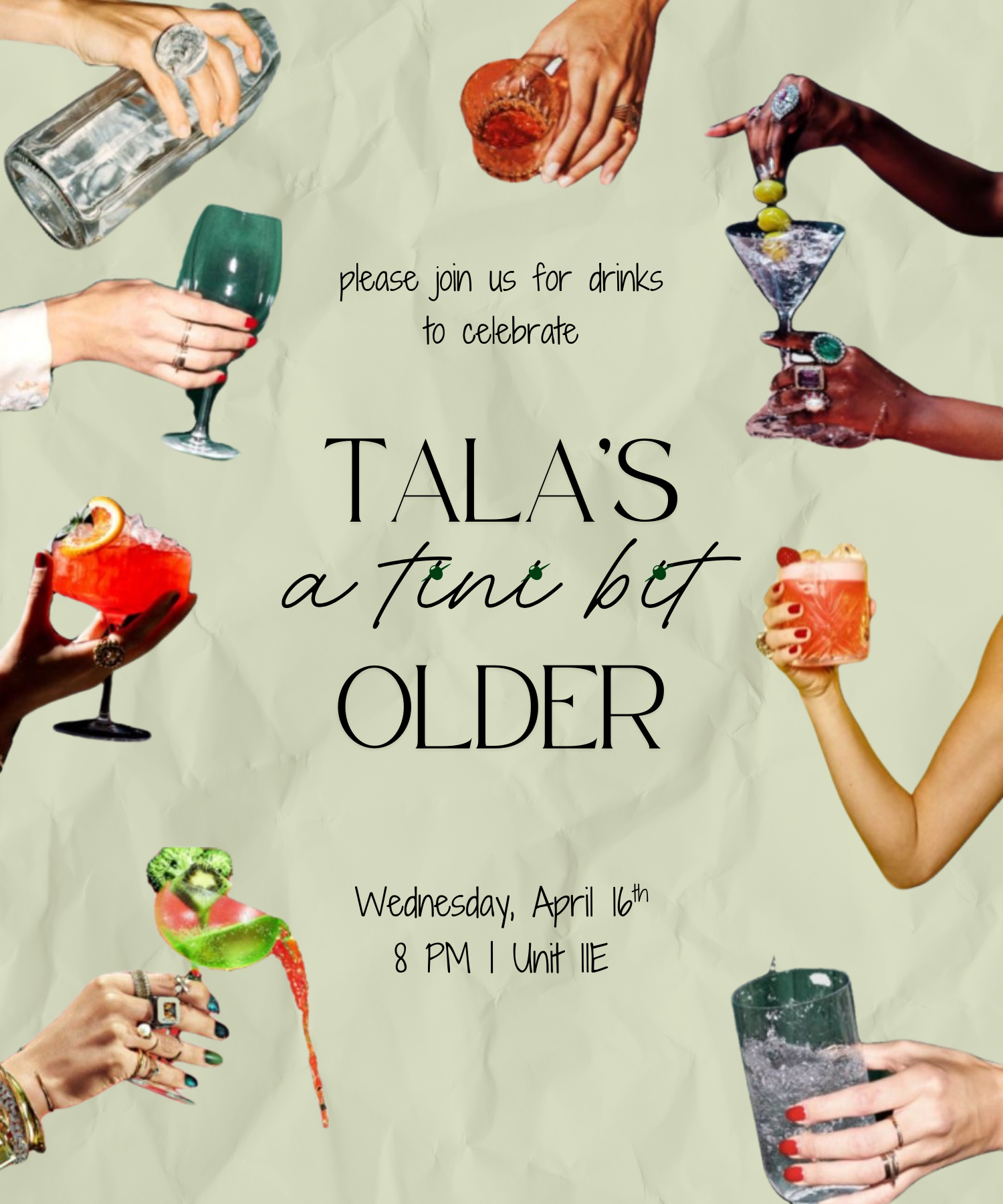
TalaTini’s Twenty First
TalaTini’s Twenty First was developed as a playful, cocktail-forward birthday identity centered on wit and visual storytelling. The phrase “a tini bit older” anchored the concept, influencing typography, imagery, and color direction across the invitation. By blending lifestyle photography with editorial-style type, the design established a tone that felt celebratory, polished, and personality-driven before guests even arrived.
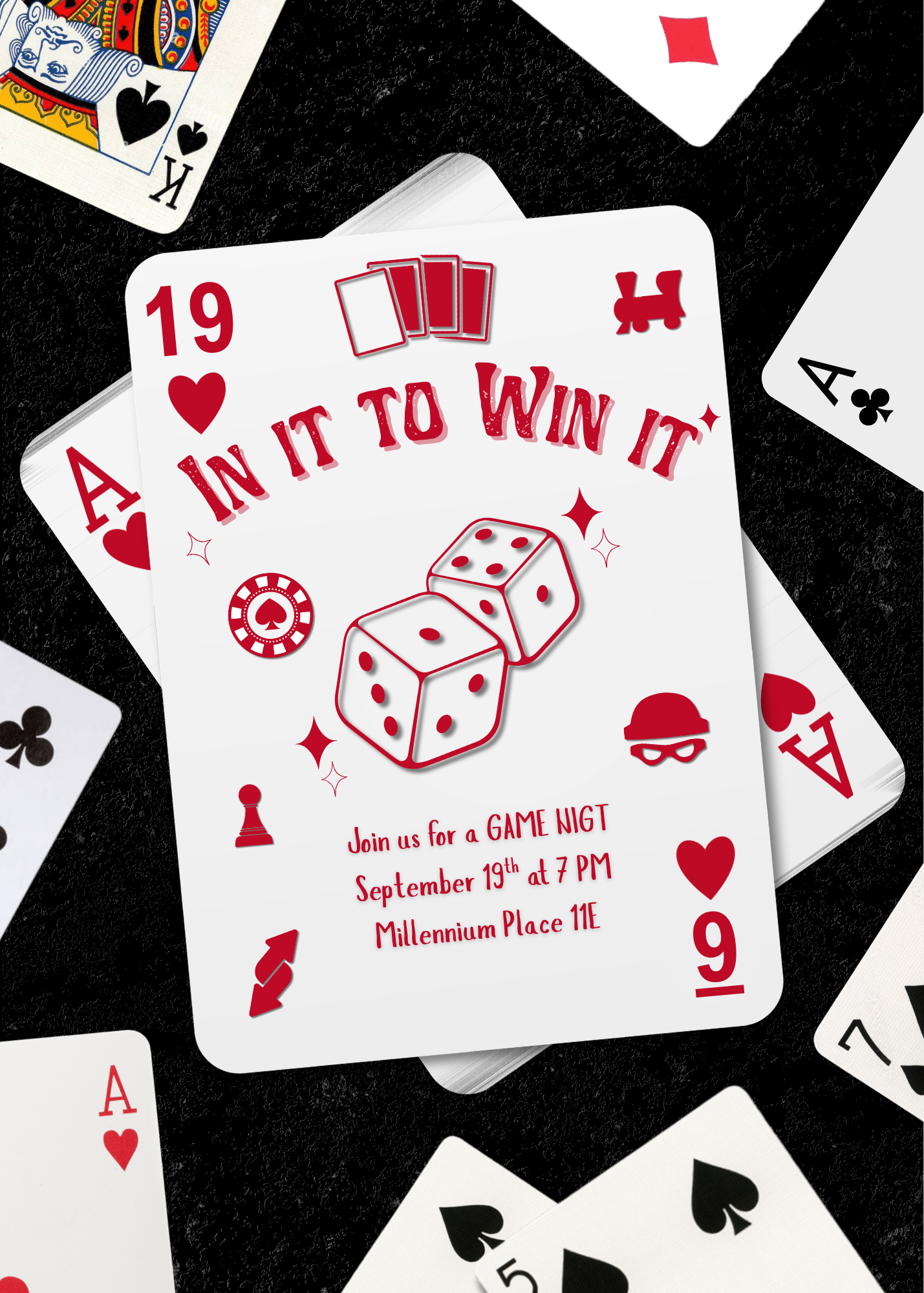
In it to Win it Game Night
In It to Win It was designed as a bold, casino-inspired event identity built around contrast and high-energy visual cues. Red graphic elements, card symbolism, and playful iconography reinforced the competitive theme while maintaining clarity in layout and hierarchy. The invitation functioned as both announcement and atmosphere-setter, translating the excitement of game night into a cohesive, immersive moment.
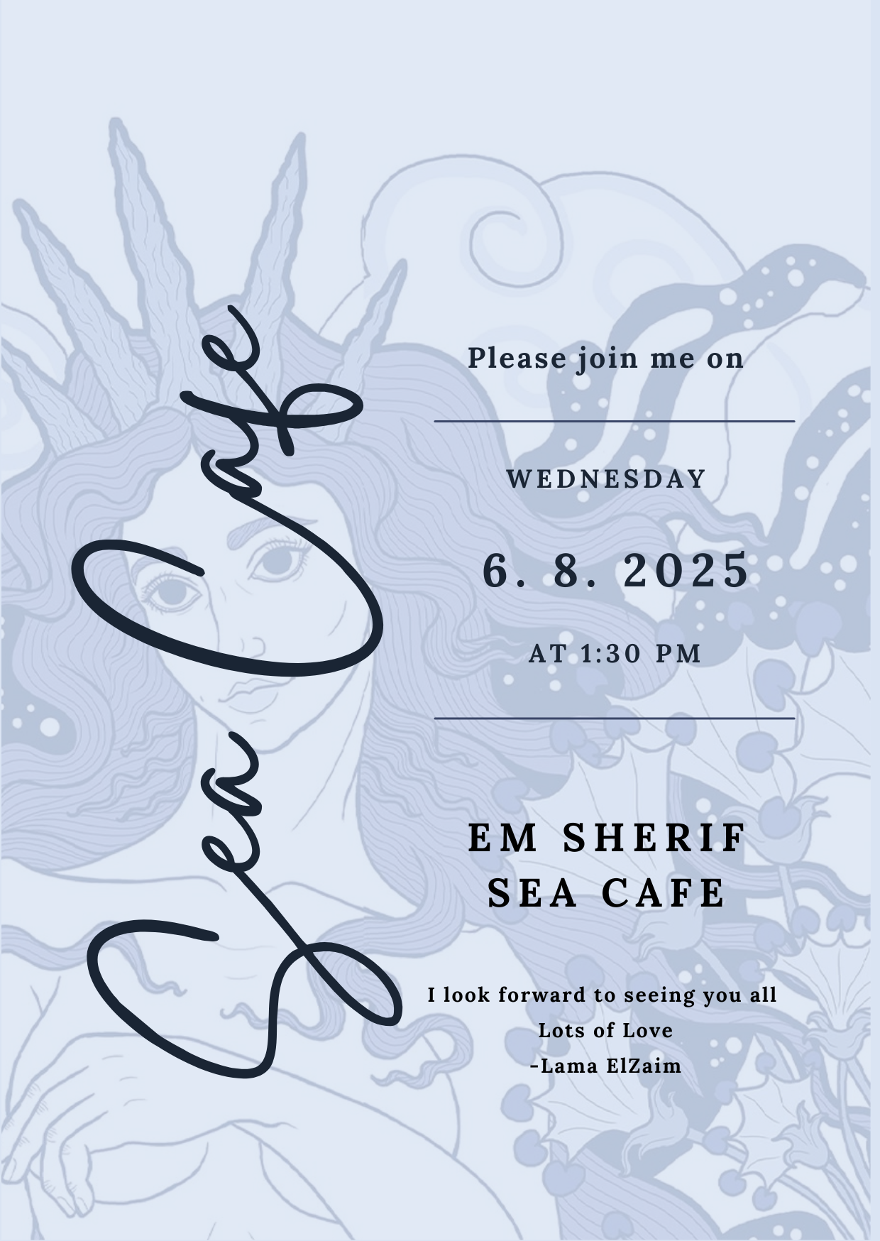
Em Sherif Sea Cafe
The Em Sherif Sea Cafe invitation was developed with restraint and elegance, drawing inspiration from Mediterranean motifs, the mural in the restaurant and refined typography. A soft blue palette and delicate illustrative elements created a visual language aligned with the venue’s aesthetic and coastal atmosphere. The design prioritized balance and hierarchy, allowing the typography and subtle graphics to evoke sophistication while maintaining clarity and warmth.